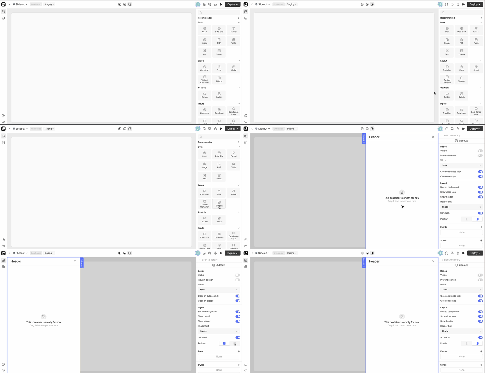
Placing a slideout in your app

Placing a slideout in your app

Accessing a closed slideout in the editor
| Property | Type | Default value | Behavior |
|---|---|---|---|
| Blurred background | boolean | true | Determines whether a dark blurred background should cover the UI. |
| Close on escape | boolean | true | When set to true, an open slideout closes when the user hits the escape key. Otherwise, this keypress is ignored. |
| Close on outside click | boolean | true | When set to true, an open slideout closes when the user clicks outside its content, i.e. on the blurred background. It is recommended to disable this for complex slideouts, of which the user would not like to lose state easily. |
| Header text | stringWithJs | 'Header' | The text to be displayed in the header. Only available when the "Show header" property is set to true. |
| Position | 'left' | 'right' | 'right' | Defines the position of the slideout on the screen. |
| Scrollable | boolean | true | Determines whether the slideout content is scrollable or not. When set to false, overflowing content is not be accessible for the end user. |
| Show close icon | boolean | true | Determines whether there should be the "x" icon in the top-right corner for closing the slideout. In case "Show header" is set to false, the icon might overlap with the slideout content. |
| Show header | boolean | true | Determines whether the slideout should have a header. When set to true, the header text can be configured via the "Header text" property. |
| Visible | boolean | false | The "Visible" property behaves differently than in other components. For the Slideout, this property determines whether the slideout is open or closed. You might apply a dynamic JavaScript expression here, but usually a slideout should be opened or closed explicitly using the exposed functions. |
| Width | string | '60vw' | CSS width of the slideout. See considerations above. |
| Property / Function | Type | Behavior |
|---|---|---|
blurredBackground | boolean | Current boolean value of the "Blurred background" property. |
close() | () => void | Closes the slideout and executes the "On hide" action asynchronously. Noop in case the slideout is not open. |
closeOnEscape | boolean | Current boolean value of the "Close on escape" property. |
closeOnOutsideClick | boolean | Current boolean value of the "Close on outside click" property. |
headerText | string | Current string value of the "Header text" configuration. |
hide() | () => void | Alias for close(). |
open() | () => void | Alias for show(). |
setBlurredBackground(value) | (value: boolean) => void | Sets the "Blurred background" property to the provided boolean value. |
setCloseOnEscape(value) | (value: boolean) => void | Sets the "Close on escape" property to the provided boolean value. |
setCloseOnOutsideClick(value) | (value: boolean) => void | Sets the "Close on outside click" property to the provided boolean value. |
setHeaderText(value) | (value: string) => void | Sets the header text to the provided string value. |
setShowCloseIcon(value) | (value: boolean) => void | Defines if the close icon should be displayed or not. |
setShowHeader(value) | (value: boolean) => void | Adjusts the flag whether the header text should be displayed to the provided boolean value. |
| setWidth(value) | (value: number) => void | Sets the "Width" property to the provided string value. The value should be a valid CSS expression. This is not validated. |
show() | () => void | Opens the slideout and executes the "On show" action asynchronously. Closes any other slideout that is currently open. Noop in case the slideout is already open. |
showCloseIcon | boolean | Current boolean value fo the "Show close icon" property. |
showHeader | boolean | Current boolean value of the "Show header" configuration. |
width | string | Current css-string value of the "Width" property. |