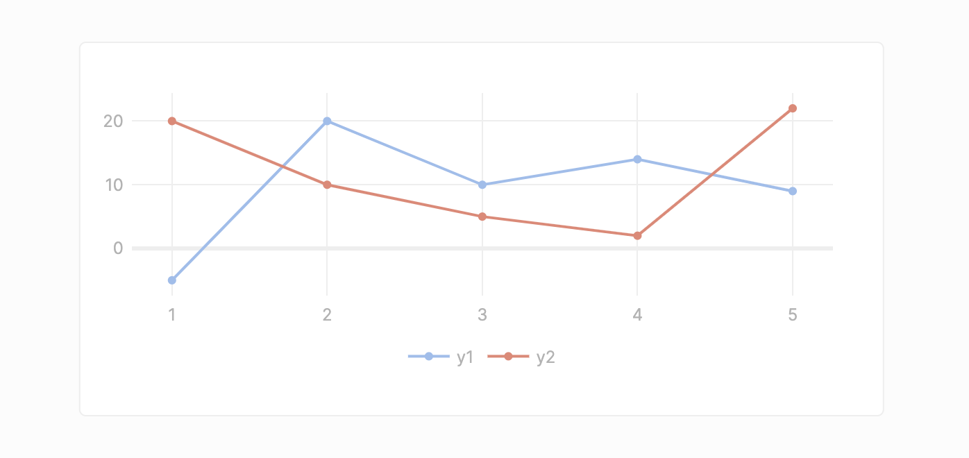
Chart

With the Chart component you can easily create graphs or charts to visualize and interpret your data. Our default properties offer enough configurability to quickly create basic chart types like line, area and bar charts. For users with more advanced needs, we added the ability to create fully customizable visualizations by using the plotly.js API with which the theme of the chart can be adapted to your branding and even sophisticated 3-dimensional graphs can be created.

Data structure

The Chart component expects one of three specific JSON structures.

In the following, we demonstrate this based on our default data that contains three data series as columns in a table:

xy1y2

1

-5

20

2

20

10

3

10

5

4

14

2

5

9

22

1. Object of arrays

Each key represents the name of the data series and each value the content of the data series.

{
    x: [1, 2, 3, 4, 5],
    y1: [-5, 20, 10, 14, 9],
    y2: [20, 10, 5, 2, 22],
}

2. Array of objects

Each object in the array represents a single data point with all it's dimensions.

[
    {
        x: 1,
        y1: -5,
        y2: 20
    },
    {
        x: 2,
        y1: 20,
        y2: 10
    },
    {
        x: 3,
        y1: 10,
        y2: 5
    },
    {
        x: 4,
        y1: 14,
        y2: 2
    },
    {
        x: 5,
        y1: 9,
        y2: 22
    }
]

3. Table structure

This is the usual structure that is returned for an query action and the very same structure we use for our Table component. If you have an action that fetches data right from your data source, you can, thus, simply input actionName.data and it will populate your chart component.

{
    'headers': ['x', 'y1', 'y2'],
    'records': [
        [1, 2, 3, 4, 5],
        [-5, 20, 10, 14, 9],
        [20, 10, 5, 2, 22],
    ]
}

Note that any data series can be chosen as the x-axis value. We will, by default, infer a suitable x-axis value from the provided data for you. Regardless, all data series can be added to the y-axis.

Data properties

PropertyTypeDefault valueBehavior

Data

object

Example as shown in data structures.

Type

'Line' | 'Area' | 'Scatter' | 'Bar' | 'Pie'

'Line'

Defines that type of the chart in which the provided data should be presented. Additional chart types can be used when using the Plotly configuration.

Orientation

'vertical' | 'horizontal'

'vertical'

For the bar chart, there is an additional property that defines the orientation of the chart.

X-Axis field

string

'x'

Contains all data series from the provided data. In the dropdown, the data series that should represent the x-axis can be selected. For the pie chart, the x-axis field reflect the labels.

Data series

array

['y1', 'y2']

Represents the data series on the y-axis of the chart. Additional data series can be added via "Add data series". Each data series has some configurable properties themselves (see below).

Data series properties

Each data series possesses some properties of their own:

PropertyTypeDefault valueBehavior

Name

stringWithJs

inferred

Name of the data series.

Y-Axis field

color

inferred

Contains all data series from the provided data. It allows you to select the data that should be associated with your data series.

Color

stringWithJs

inferred

The color of the trace (line, bar, etc.) of your data series.

Aggregation - Enabled

boolean

'false'

For data points that don't have unique x-axis values, this allows you to aggregate them into a single y-axis value. Note: Aggregation is not supported by the pie chart.

Aggregation - Method

'Count' | 'Sum' | 'Average'

'Count'

If aggregation is enabled, this input defines how the data series should be aggregated. E.g. if we choose 'Sum', all data points that have the same x value are summed up and presented as the y-axis value. Note: For non-numeric values, only 'count' is avalable as an aggregation method.

As mentioned above, we provide some basic customization options for the user to create their first chart quickly. Beyond that, the user has the choice to fully customize their chart using plotly.js's API. Therefore, we offer a Mode switch to quickly switch between our form-based configuration and Plotly's JSON configuration format. When you switch from the form-based input to the JSON configuration, all specifications that were made in the form are synced to/reflected in the JSON.

We recommend to review their documentation to specify exactly what you need.

For reference, here is an example of a viable Plotly data configuration:
[
  {
    type: "scatter",
    mode: "lines+markers",
    name: "y2",
    orientation: "v",
    marker: {
      color: "#E78573"
    },
    x: chart1.formattedData.x,
    y: chart1.formattedData.y2
  },
  {
    type: "scatter",
    mode: "lines+markers",
    name: "y1",
    orientation: "v",
    marker: {
      color: "#9ABEED"
    },
    x: chart1.formattedData.x,
    y: chart1.formattedData.y1
  }
]

Layout properties

PropertyTypeDefault valueBehavior

Title

stringWithJs

''

Defines the title of the chart.

Show legend

boolean

true

Determines if a legend is displayed in the chart component.

Legend position

'left' | 'top' | 'bottom' | 'right'

'bottom'

If a legend is displayed, this property determines its position.

X-Axis - Title

stringWithJs

''

Defines the title placed next to the x-axis.

X-Axis - Show labels

boolean

true

Determines if the labels are displayed on the x-axis.

X-Axis - Show grid

boolean

true

Determines if the grid (grid lines and axis) is shown for the x-axis.

Y-Axis - Title

stringWithJs

''

Defines the title placed next to the y-axis.

Y-Axis - Show labels

boolean

true

Determines if the labels are displayed on the y-axis.

Y-Axis - Show grid

boolean

true

Determines if the grid (grid lines and axis) is shown for the y-axis.

Users that prefer to customize the layout and appearance of their chart can use Plotly's JSON configuration format. The Custom configuration is conveniently accessible via the Mode switch. When you switch from the form-based input to the JSON configuration, all specifications that were made in the form are synced to/reflected in the JSON.

We recommend to review their documentation to specify exactly what you need.

For reference, here is an example of a viable Plotly layout configuration:
{
  font: {
    family: "Inter",
    color: "#B3B3B3"
  },
  margin: {
    r: 20,
    l: 20,
    b: 20,
    t: 20,
    pad: 5
  },
  hoverlabel: {
    bgcolor: "#FFFFFF",
    bordercolor: "#E1E1E1",
    font: {
      color: "#323232",
      family: "Inter",
      size: 12
    }
  },
  showlegend: true,
  legend: {
    xanchor: "center",
    yanchor: "top",
    orientation: "h",
    x: 0.5,
    y: -0.2
  },
  colorway: [
    "#9ABEED",
    "#E78573",
    "#B8D279",
    "#B481BB",
    "#F9C56A",
    "#9490D7",
    "#9CD2C8",
    "#BCB8D8",
    "#F3B7A6",
    "#F9EE8A",
    "#F4D0E5"
  ],
  xaxis: {
    automargin: true,
    showgrid: true,
    showticklabels: true,
    zeroline: true,
    zerolinewidth: 3,
    zerolinecolor: "#eeeeee"
  },
  yaxis: {
    automargin: true,
    showgrid: true,
    showticklabels: true,
    zeroline: true,
    zerolinewidth: 3,
    zerolinecolor: "#eeeeee"
  }
}

Events

Chart does not offer any events.

API

PropertyTypeBehavior

formattedData

() => object

Returns the data underlying the chart in a unified format, including the x-axis input and all data series. This is required since we allow different structures as data input.

Last updated