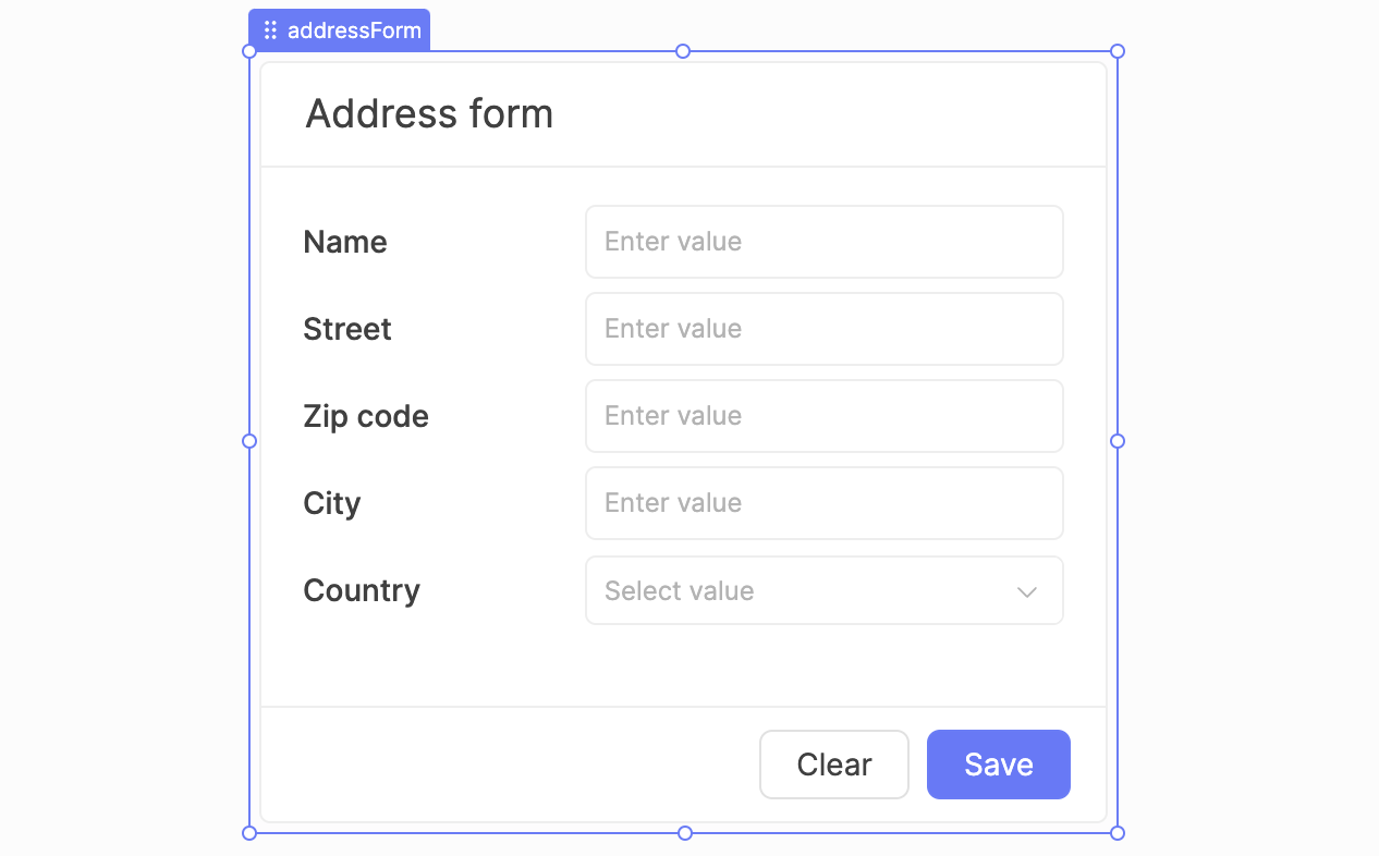
Form component in action

Form component in action

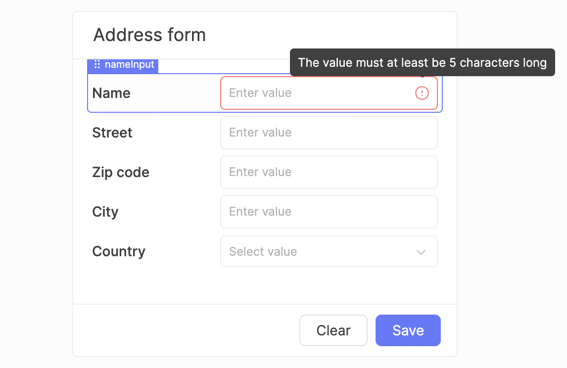
Submitted form with a child component with validation error

Different form settings on submit

Full type support for form data getter

Type support for providing format hints

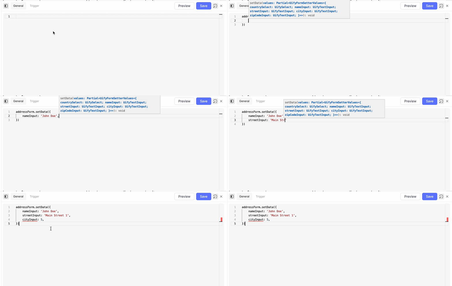
Type support when using setData()
| Property | Type | Default value | Behavior |
|---|---|---|---|
| Button disabled | boolean | false | Whether the submit button should be disabled or not. |
| Cancel button disabled | boolean | false | Whether the secondary cancel button should be disabled or not. This property is only accessible when "Show cancel button" is set to true |
| Cancel button text | stringWithJs | 'Cancel' | Label of the secondary cancel-button. This property is only accessible when "Show cancel button" is set to true |
| Clear after submit | boolean | true | When set to true, all child inputs of the form are cleared after successful execution of the "On submit" action - unless it returns false. Learn more |
| Disable while submit | boolean | false | When set to true, all child inputs, the submit-button and the cancel-button are temporarily disabled while the "On submit" action is running. Learn more |
| Full width | boolean | false | When set to true, the submit and cancel button will take the entire width of the form, instead of just enough space to contain their labels. |
| Header text | stringWithJs | 'Header' | The text to be displayed in the form header. This property is only accessible when the "Show header" property is set to true |
| Hide submit button | boolean | false | When set to true, the submit button is not displayed at all. This is relevant for use cases where a form should only be submitted programmatically. |
| Scrollable | boolean | true | Determines whether the user can scroll to overflowing content, or whether that content will be hidden. |
| Show cancel button | boolean | false | Whether the secondary cancel button should be displayed next to the submit button or not. |
| Show header | boolean | false | When set to true, the form will show a textual header, that can be configured with the "Header text" property. |
| Show loading while submit | boolean | true | When set to true, both the submit and cancel button display a loading spinner while the "On submit" action is running instead of their labels. Learn more |
| Text | stringWithJs | 'Submit' | The label of the submit button. |
| Validate on submit | boolean | true | When set to true, all validation rules and "Required" properties of child inputs will be evaluated. In case of any validation error, the form submission will be aborted and errors will be rendered for all affected inputs. Learn more |
| Property / Function | Type | Behavior |
|---|---|---|
buttonColor | string | Provides the color of the submit button. |
buttonDisabled | boolean | Provides the current boolean value of the "Button disabled" property, i.e. whether the submit button is currently disabled or not. This does not take into account potential disabling during submit. |
buttonFullWidth | boolean | Provides the current boolean value of the "Full width" property. |
buttonText | string | Provides the submit-button label, i.e. the current value of the "Text" property. |
buttonTextColor | string | Provides the text-color of the submit button. |
cancelButtonDisabled | boolean | Provides the current boolean value of the "Cancel button disabled" property, i.e. whether the cancel button is currently disabled or not. This does not take into account potential disabling during submit. |
cancelButtonText | string | Provides the cancel button label, i.e. the current value of the "Cancel button text" property. |
clear() | () => void | Clears all form child inputs, i.e. sets their value to "empty". The semantics of that depend on the component type. |
clearOnSubmit | boolean | Provides the current boolean value of the "Clear on submit" property. |
disableWhileSubmit | boolean | Provides the current boolean value of the "Disable while submit" property. |
getData(options) | (options: object) => object | Provides values of all direct and nested child inputs in one object, keyed by component name. The options determine the value formats. Learn more |
headerText | string | Provides the current value of the "Header text" property. |
hideButton | boolean | Provides the current boolean value of the "Hide submit button" property. |
reset() | () => void | Similar to clear(), however instead of making each child component empty, they are reset to their "default value". This allows to not clear the form entirely, but rather to reset it to the same default state that it had on initial app load. |
showHeader | boolean | Provides the current boolean value of the "Show header" property. |
showLoadingWhileSubmit | boolean | Provides the current boolean value of the "Show loading while submit" property. |
setButtonColor(value) | (value: string) => void | Sets the submit button color to the provided string value. |
setButtonDisabled(value) | (value: boolean) => void | Sets the "Button disabled" property to the provided boolean value. |
setButtonFullWidth(value) | (value: boolean) => void | Sets the "Full width" property to the provided boolean value. |
setButtonText(value) | (value: string) => void | Sets the submit button label to the provided string value. |
setButtonTextColor(value) | (value: string) => void | Sets the text color of the submit button to the provided string value. |
setCancelButtonDisabled(value) | (value: boolean) => void | Sets the "Cancel button disabled" property to the provided boolean value. |
setCancelButtonText(value) | (value: string) => void | Sets the "Cancel button text" property to the provided string value. |
setClearOnSubmit(value) | (value: boolean) => void | Sets the "Clear on submit" property to the provided boolean value. |
setData(data) | (data: object) => void | Fills the form child inputs with the provided values. Learn more |
setDisableWhileSubmit(value) | (value: boolean) => void | Sets the "Disable while submit" property to the provided boolean value. |
setHeaderText(value) | (value: string) => void | Sets the "Header text" property to the provided string value. |
setHideButton(value) | (value: boolean) => void | Sets the "Hide submit button" property to the provided boolean value. |
setShowHeader(value) | (value: boolean) => void | Sets the "Show header" property to the provided boolean value. |
setShowLoadingWhileSubmit(value) | (value: boolean) => void | Sets the "Show loading while submit" property to the provided boolean value. |
submit() | () => Promise<void> | Submits the form, i.e. applies exactly the same logic like when the user clicks on the submit button. This triggers a sequence of events, about which you can read more here. |