Selects
Last updated
Last updated
The Select
and Multiselect
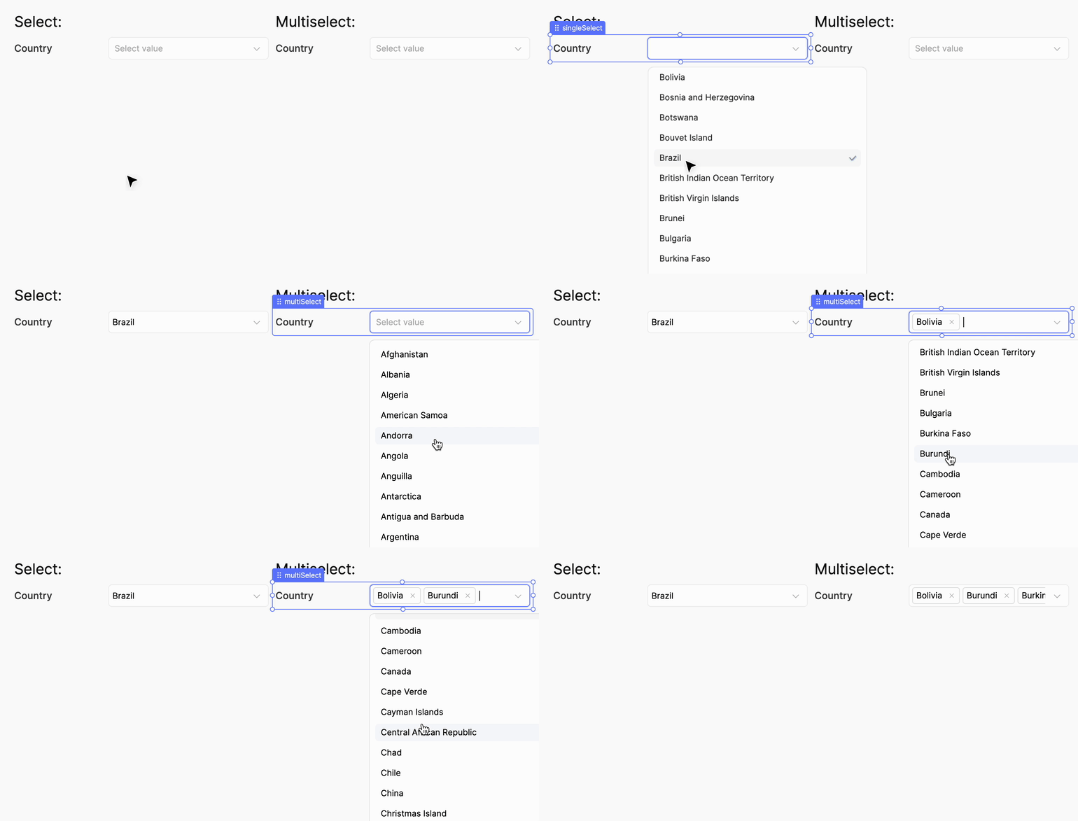
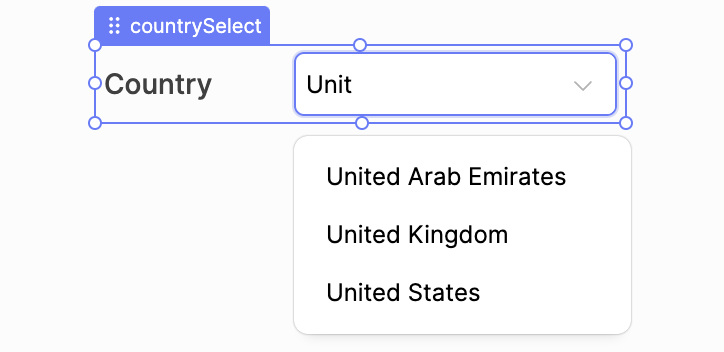
components offer the user a choice from a configurable set of options in a dropdown. Depending on the type, either exactly one or any amount of options can be selected. A textual search supports the user with finding the right options.
The Select
and Multiselect
differ only in one key aspect. The Select
allows the selection of only a single option at most, while the Multiselect
allows the selection of as many options as the user likes. Due to this, selected values are visualized differently.
The Multiselect
renders all selected options and allows to remove them with one click on the "x" icon. For a convenient selection and deselection of multiple options at once, the Multiselect
keeps the dropdown open while selections are made. The dropdown of the Select
is closed immediately after an option was selected or deselected.
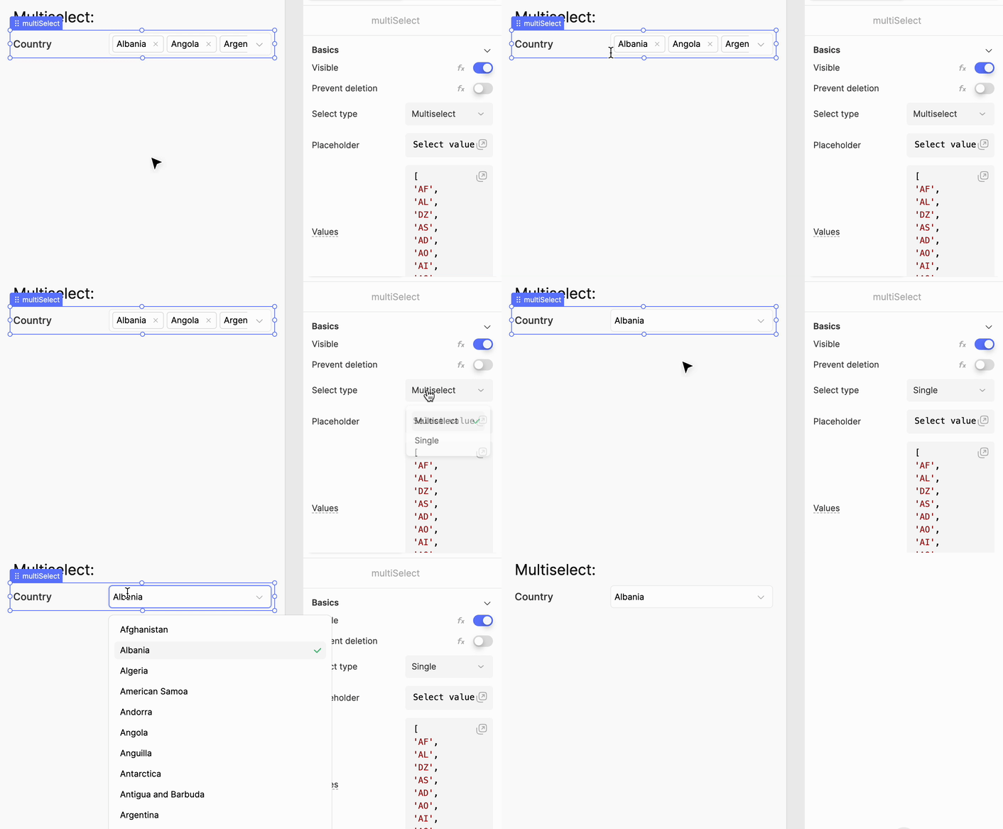
The "Select type" property turns a Select
component into a Multiselect
and vice versa. In case of a Multiselect
with multiple selected options being turned into a Select
, only the first selected option is kept.
Like the native HTML <select>
, the values and rendered labels of the options may be different. In the country select examples above, ISO country codes like AU
are used as values, while the visualized labels are the full country names like Austria
. These values and labels are configured separately in the properties panel with the "Values" and "Labels" properties. Internally, these properties must have the following structure:
The values are a list of all values offered in the dropdown. The options are sorted in the same order as the values in this array. The labels can be an array of strings, and are then matched with the value in the same index. If the labels are provided as a string-to-string mapping, values are matched to labels by looking up the value in that dictionary:
Option 2 is useful when the values are dynamic. In this case, you can provide the entire dictionary of possible values, regardless of which values are currently offered. Otherwise, you need to make sure that labels are always filtered and sorted in the same way as the values.
The matching of labels to values is performed according to the following rules:
null
and undefined
in values are ignored, i.e. they are removed before matching to labels.
If labels are not provided at all, or do not evaluate to either an array or a dictionary, values are used as labels directly.
If there are less values than labels, the additional labels are ignored.
If there are more values than labels, the values without labels at their matching index are used as labels directly.
If labels are provided as dictionary, but a value does not occur as key, that value is used as label directly.
Values of type number
used as labels are stringified for the key.
The Select
components offer the following configuration properties.
Property | Type | Default value | Behavior |
---|---|---|---|
Alignment |
|
| Alignment of the label text next to the select. |
Allow empty |
|
| Whether the select may have no option selected or not. When set to |
Allow search |
|
| When set to |
Default values |
|
| Values of the options that should be selected after initial app load. When the |
Disabled |
|
| Whether the select should be disabled. When disabled, the component is greyed out and the dropdown cannot be opened. |
Label |
|
| Text label shown next to the select. |
Labels |
|
| Rendered option labels. Learn more |
Placeholder |
|
| Placeholder shown in the select when no value has been selected yet. |
Required |
|
| Whether at least one value must be selected when a surrounding form is submitted. Otherwise, form submission is aborted. Learn more about form submission |
Select type |
| Depends on chosen component type | Changes the component type to the chosen one. Learn more |
Values |
| Numbers from 1 to 10 | Option values. Learn more |
The Select
components offer three UI events:
On change run: Action is run whenever the user changes selection. It is not executed when selection is changed programmatically in any way.
On focus run: Action is run when the select gains focus.
On blur run: Action is run when the select loses focus.
None of the associated actions receive any arguments when triggered.
The Select
components expose the following API in the JavaScript runtime environment.
Property / Function | Type | Behavior |
---|---|---|
|
| Deselects all options. |
|
| Provides the current boolean value of the "Disabled" property. |
|
| Provides the current value of the "Labels" property. No validation is applied, i.e. you receive the raw value, even if it is neither an array nor a dictionary (learn more). |
|
| Sets the selected options to the current value of the "Default values" property. |
|
| Sets the value of the "Disabled" property to the provided boolean value. |
|
| Sets the selected values to the provided array. Values are stored even if they do not appear in the "values" property. This means, that a select may have entries in its selected values which may not be rendered. The select is cleared when |
|
| Sets the selected value to the provided one. Like with |
|
| Provides the selected value, or |
|
| Provides the currently selected values as array. Empty array in case nothing is selected. |